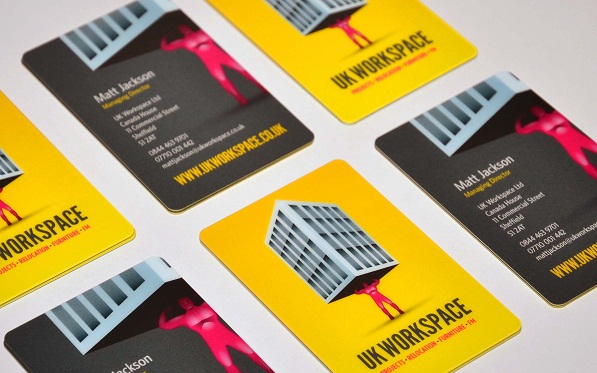
Chris is the designer of the UK Workspace cards featured in our gallery; we went to meet him and began by asking him about his inspiration for his design.
I can get quite intensive when I work; a lot of it’s just how I feel about something. The client, UK Workspace, had, at the time three divisions; relocation, furniture and facilities management, the projects part wasn’t part of it.
The initial ideas were of an Atlas type figure carrying a large light bulb box that actually looked quite nice, but we had to figure out a way to introduce furniture in order for everything to keep the same shape.
We settled on the Atlas type figure carrying a building. Trying to get the proportions right and trying to draw people is really quite hard, especially feet which were always going to be absolutely tiny. It’s the most intensive logo, actually the most complicated logo I’ve ever produced but everything has a purpose and everything resolves.

Sorry Chris, what do you mean “resolves”?
Everything there is there for a reason and everything makes sense in and of itself, but it also needed to be quite stylised. So for example the building has no doors but it has enormous windows. You don’t need two thousand tiny windows on a massive building, it needs to just represent something rather than be something.
The client was happy to go down this road because it was quite representative of what his business did but was never going to be everything it did. The branding was flexible enough to be everything they needed at the time but now allows me to re-work it to add to the strap-line, for Fit Out, another service they now offer.
We wanted something that was quite strong, almost like a punch in the face, so the letterheads are bright yellow on the face with dark grey backs. When they’re folded in envelopes you can’t see the yellow; when you open them up there’s suddenly an intensely bright “hit” of yellow.
You’re a freelance graphic designer, what advice would you give to someone starting out on how to find clients?
Clients will find you, I did a lot of breakfast networking when I started out and it never really amounted to anything (but I made some very good friends). It’s a useless place to go for new business as everyone there is trying to sell their business to you and really have no interest in design services, so cross it off the list.
Not breakfast networking then.
Definitely not breakfast networking, networking in general is a waste of time you can better spend being productive. There are a thousand other graphic designers trying the same thing – to make connections.
“Connections” are great if you know the right people and if you get introduced to the right people, but you rarely will do because all the people there have the time to take 3 hours off in the morning once a week and go to breakfast networking.
I don’t have that time, I’m sure you don’t have that time. It doesn’t make sense, but for IFAs, virtual assistants, people like that, yeah great do it, but not if you’re a graphic designer. Clients will find you; if your work is good and your work is visible they will find you.
What do they need to do to be visible?
They need to have a decent website – a decent well put together website – and they need to have decent links to their website and they just need to be everywhere. Even if it’s just social, gallery openings for example. Don’t focus on business, business will find you, but people know people, so try and get in with people who actually know people and work from that, but not in a forced business networking environment.
So designers starting out need to be visible.
They need a good website, a good straightforward website, but also don’t spend a lot of time on your own branding. I know, I have friends who are (unsurprisingly) designers and they spend so much time sorting out their own branding that the work for clients simply isn’t as good as their own branding.
Is a designer’s worst client himself/herself?
Yes, as you can do, well, everything, it’s much harder to know what you want so the best thing you can do is eliminate that as a problem entirely. I don’t have a branding as such, I use certain typefaces and colour schemes but I don’t do much more than that simply because the work on my website isn’t about me, it’s about what I can do for my clients.
There’s a certain connection I need to make with potential clients and the best way I can make that is by showing them what I’ve done and having them like it.
Rather than forcing “me” on them.
The people here in Divine, are they friends of yours?
They are, Andy who works here is my former housemate and I just know the staff from being in here a few times a week for the past 18 months. I’ll bring along my iPad, notebook, laptop and usually a design-related book or magazine. This place is full of people from the local and national media and there are usually guys in from the design companies upstairs; it never hurts to make friends with them!
What are you working on at the moment?
A website and re-branding for a wine merchant, they found me on Google, I was actually sat right here when I received an enquiry saying they were looking at building an e-commerce website and would I be able to come in for a meeting?
I went in for a meeting, they liked me most out of all the designers and I got the job and it generally is that simple. I don’t believe in pitching too heavily for work – it’s just not worth the time taken.
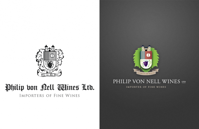
This is the original logo (below left) and this, the updated one (below right). This one was actually quite straightforward about three – four hours work in total, simply sprucing it up. The leaf is actually a grape leaf in the background, it’s unclear in the original if it’s meant to be a bush or a vine or a leaf, but simply working in terms of a shield and a badge wouldn’t work as vines as it had become too messy, so the leaf fitted the general shape of it.
The brief was to make it more modern. Things like the blackletter (the heavy, gothic typeface style) for the original version was in keeping with the German name, but blackletter is not going to help sell them as a modern, forward-thinking company – it’s quite heavy and not in proportion to the crest element so I changed it to Garamond which is quite an elegant typeface which restores a lot of that missing balance.

What did you think of your time at university?
When I was studying graphic design I found their approach to be, well, incredibly frustrating. When I had to draw myself with my left hand with a piece of charcoal without leaving the page while looking in the mirror, I quit the course.
Apparently I was thinking “too commercially”, whereas I was actually thinking “how is drawing myself with charcoal going to give my clients a better branding?”.
That was 10 years ago, and unless a lot has changed in the intervening years they really don’t teach enough commercial aspects on design courses. They’ll teach critical thinking, which is a great buzzword for… something, and about the history of the design and about all these great design houses who are currently fashionable.
But they don’t teach enough about the commercial nature of design as a commodity and they don’t teach enough about business. If you’re going to be a graphic designer you’re possibly going to be self employed or try to be self employed and there is just no teaching to do with book-keeping or self-promotion if you need it, anything like that.
They just don’t teach it and if they do it’s just skimming over it. I’ve not come across any business-orientated modules on design courses in my experience, there might be now, there weren’t some 10 years ago, and there certainly weren’t 5 years ago.
Of course you don’t need a degree to be a graphic designer. You need a certain level of skill and an eye for composition (and of course know how to use the software) but you don’t need a degree.
Do you need talent?
Yes. You do need to think a certain way about your environment – soak up information like a sponge – and it takes a while to get there. You should never be afraid to do your own thing.
Of course you have to keep up with the current design trends, but fashions change and you should too. Everything I do is different enough from the last project to mean everything should stand on its own merits.
I don’t use old bits and pieces to do new branding; I’ll concentrate on the client at hand to make sure that they’re getting the best out of me as, well, that’s what they’re paying for.
What top tip can you give to any freelance designer?
Art-working is a very handy skill to have (and should never be thought of as anything less than a skill – good layout is hard to find!) because if times are tough you can always get some simple layout jobs, do them quickly and get paid for them.
Thanks Chris, when he’s not in Divine he can be found at http://christopherdowson.info/


